HomeEd Case Study | Brand Identity & Website Design for Affordable Housing
Challenge
Capturing HomeEd’s progressive vision
For more than 40 years, HomeEd has provided Edmontonians with affordable and welcoming places to live. Hundreds of families and workers live in their rental units to gain a sense of safety, belonging, and community.
However, it was time to evolve HomeEd’s brand and website to align with their progressive vision. They had big ambitions to become Edmonton’s top provider of affordable housing. HomeEd needed a well-crafted visual identity, messaging, and online presence to better connect with potential residents and government stakeholders.
Services
Solution
Strategic insight from stakeholders
Before revamping HomeEd’s brand and website, we wanted to gain a deep understanding of their organizational purpose and community impact. Our team conducted comprehensive interviews with HomeEd’s leadership team and board of directors to identify successful elements in their current digital marketing strategy and areas requiring improvement.
For their brand identity, we thoroughly explored HomeEd’s audience pain points and aspirations, conducted competitive landscape analysis, examined the significance behind their logo and visual elements, and analyzed the core components of their brand personality and communication voice. For their website redevelopment, we systematically assessed their users’ specific needs, established accessibility and functionality requirements, and determined which content elements were most critical to feature prominently. These in-depth stakeholder conversations served as the foundation for all subsequent work, enabling our team to develop digital marketing solutions precisely aligned with HomeEd’s strategic objectives and organizational needs.
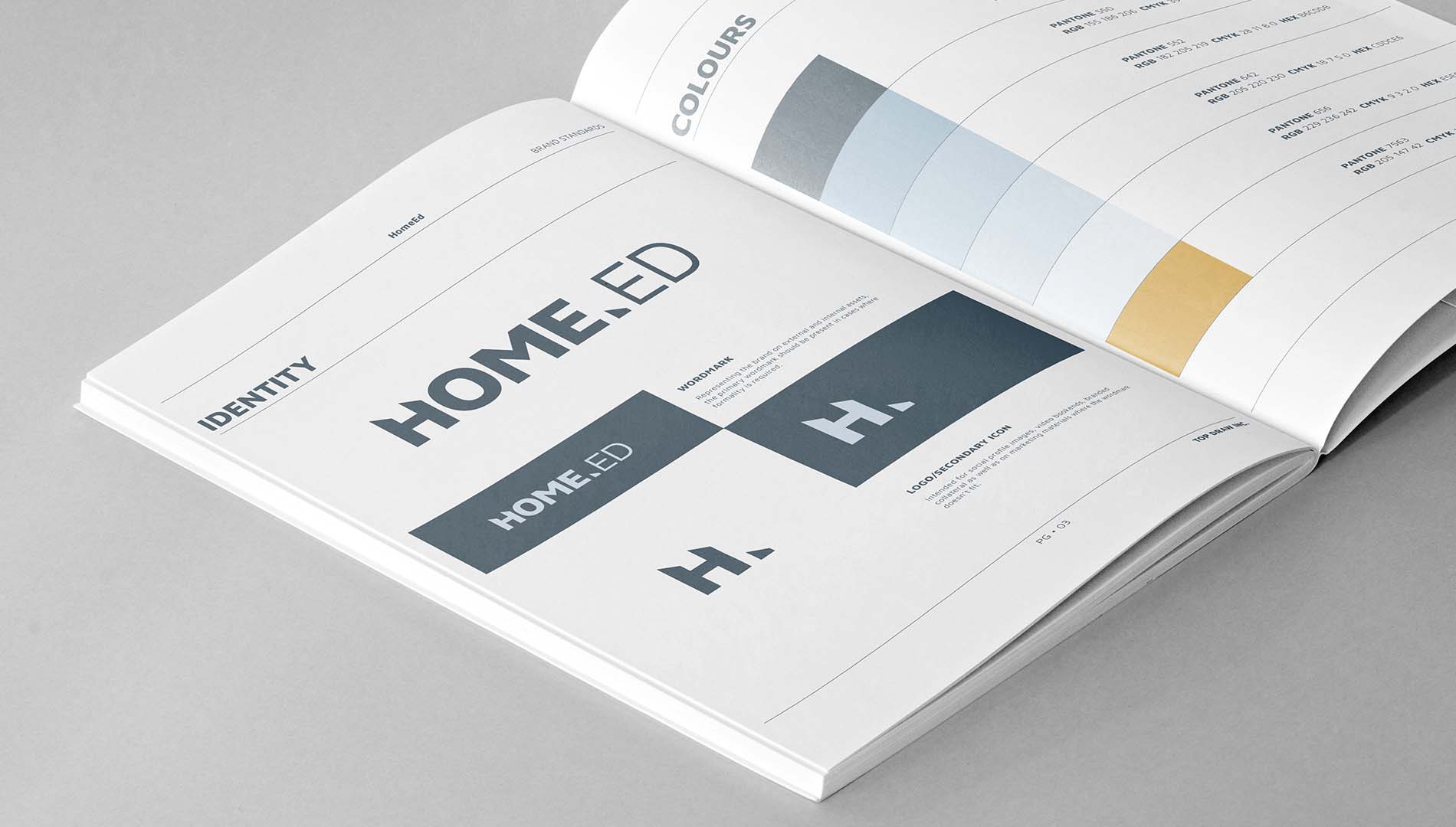
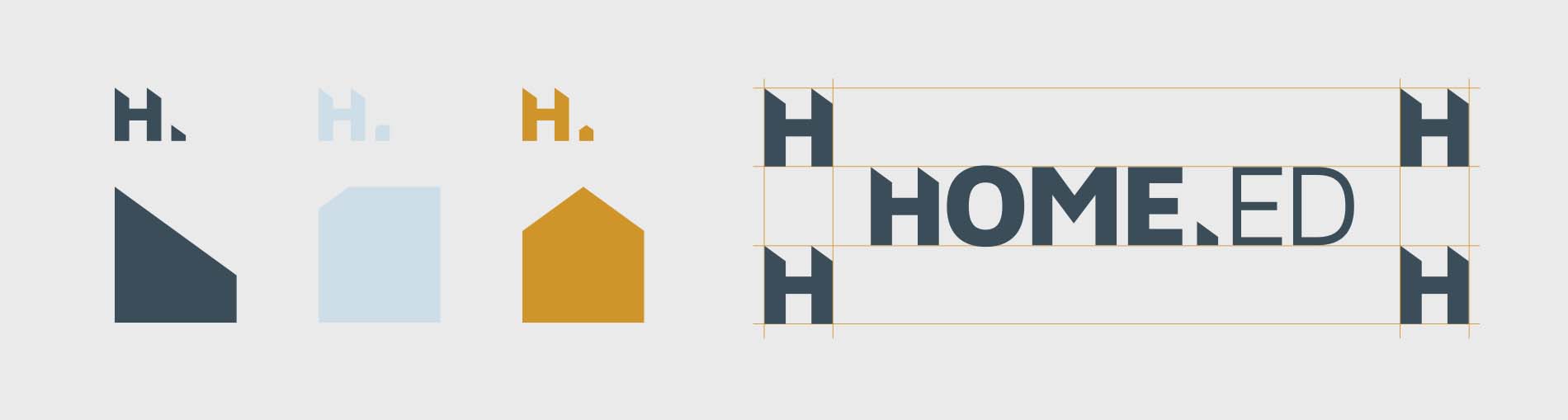
A brand identity that inspires hope and belonging
For the logo and visual identity, the structurally sound lines evoke the look of the apartments and townhomes found in HomeEd’s residential communities. The bold typefaces give an air of empathy and warmth, while the complementary sky blue and orange colours convey sincerity and optimism throughout all brand materials.
When it came to the brand language, we highlighted HomeEd’s core mission of providing Edmontonians with affordable housing and hope for a better tomorrow. Because when you have a stable home, you can build a solid foundation for community connection and personal growth. This fundamental belief inspired the meaningful tagline, “Built for belonging”. Our carefully crafted brand messaging spoke directly to the heart of how HomeEd helps local Edmonton families and essential workers thrive in their communities.
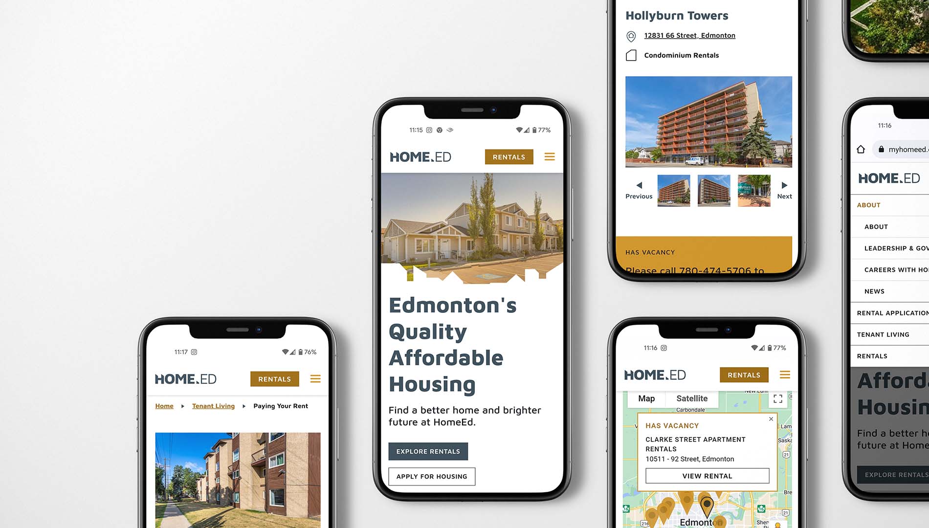
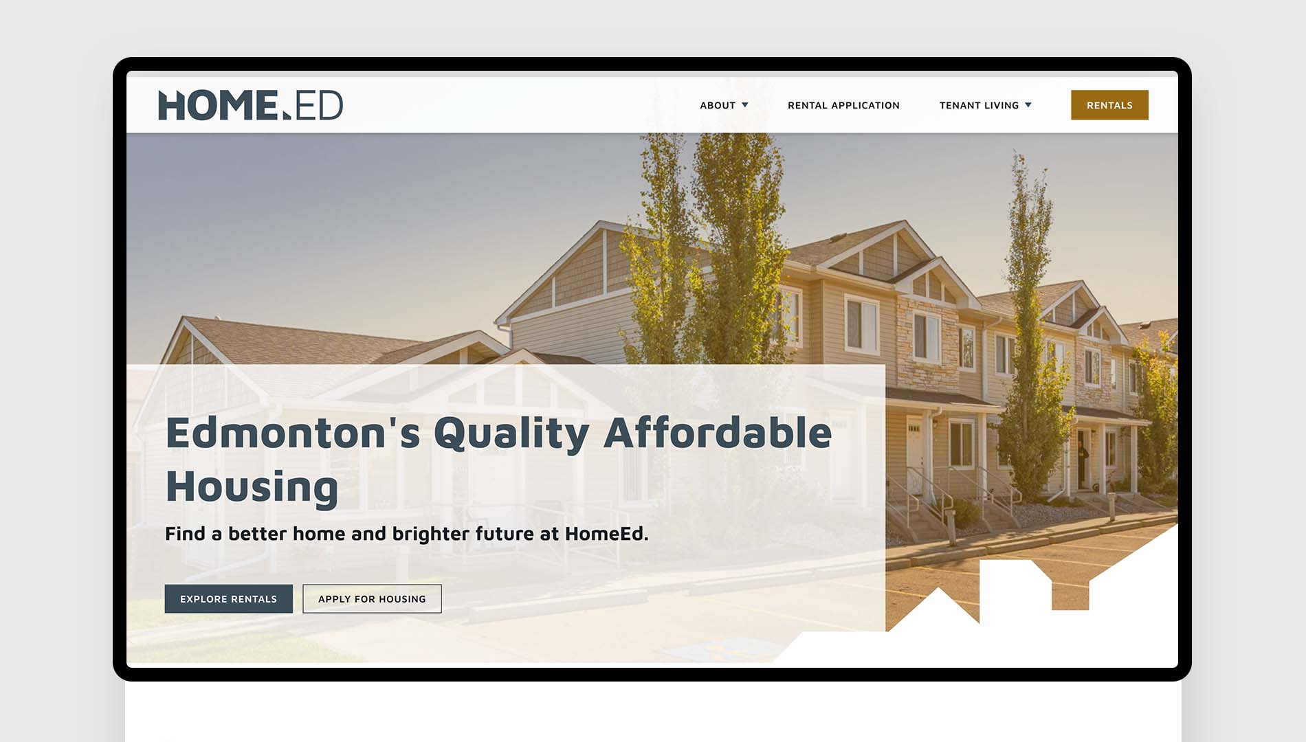
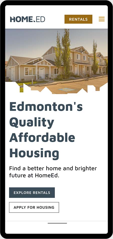
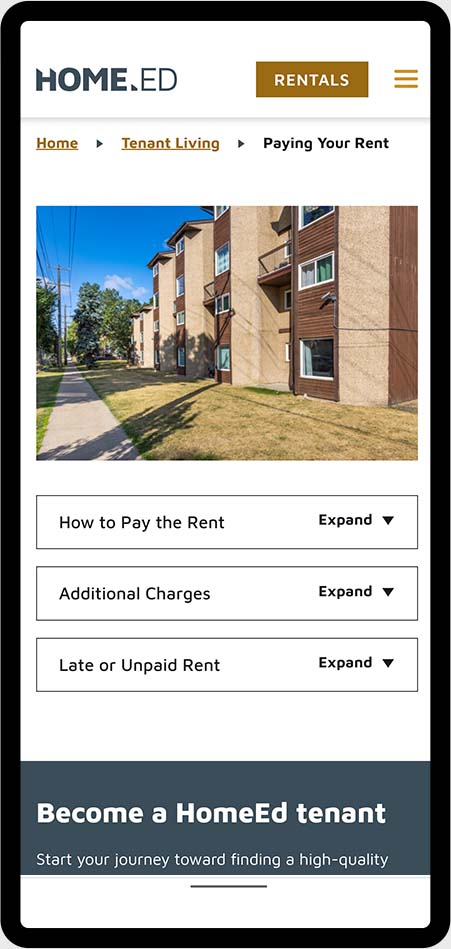
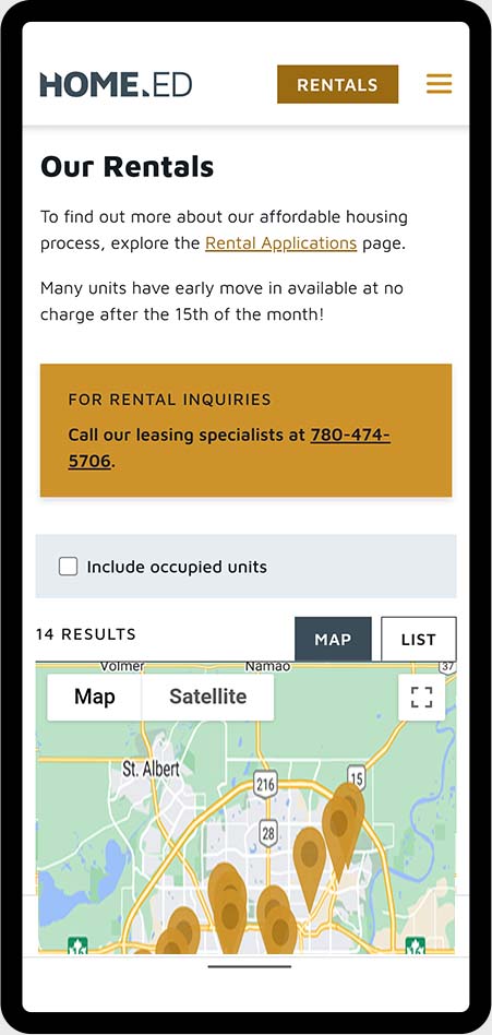
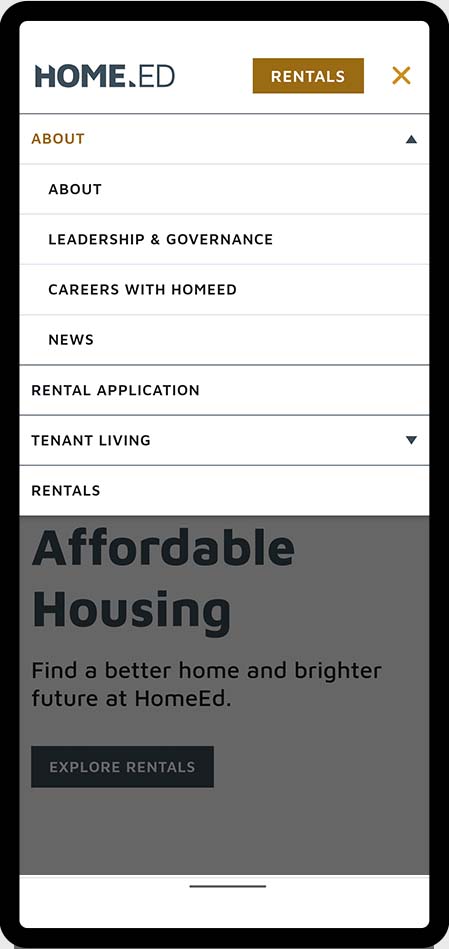
An inviting and accessible website design
When creating HomeEd’s new website, we wanted it to align with their forward-thinking brand experience while shaping a user-friendly design. The main goal was to make it as easy as possible for potential residents to find rental properties online. The website also needed to convey HomeEd’s inspiring mission of providing affordable housing in a compelling and clear way.
Because of this, user experience design was a significant focus for this project:
Information architecture (IA): Pages were carefully categorized by user need and content was strategically prioritized based on what users seek out the most
Web Content Accessibility Guidelines (WCAG) AA: Enhanced colour contrast for all design elements and descriptive labels implemented for screen readers to ensure accessibility
Responsive design: Well-considered and intentionally structured layout developed so that the mobile experience delivers the same effectiveness as the desktop experience
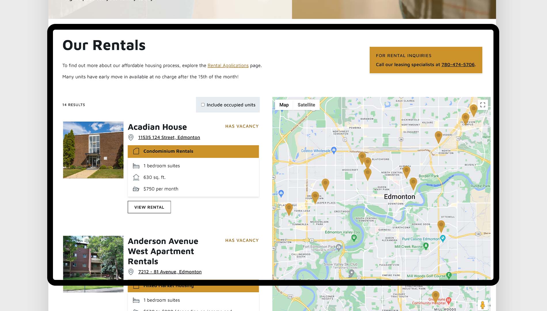
Rental map system: Interactive functionality developed for users to easily explore available properties and choose a home they love
Solid search engine optimization: Comprehensive keyword research and technical set-up completed to drive organic traffic and generate qualified leads on the website
Results
Inspiring a better future for Edmontonians
Now, HomeEd is well on their way to becoming Edmonton’s top affordable housing provider. Their new brand presents an attractive image in all of their marketing, while their website has simplified the rental process for residents. HomeEd continues to grow their portfolio of properties and expand access to affordable housing across the city.
Key Takeaways about HomeEd’s Brand Identity and Website Redesign
- HomeEd provides affordable housing to Edmonton residents for over 40 years, offering safety and community while seeking to become Edmonton’s leading affordable housing provider.
- The brand redesign process began with comprehensive stakeholder interviews to understand HomeEd’s organizational purpose and identify successful elements in their marketing strategy.
- Top Draw Inc. developed a new logo with structurally sound lines that represent HomeEd’s residential communities, using sky blue and orange colors to convey sincerity and optimism.
- The meaningful tagline “Built for belonging” emerged from HomeEd’s core mission of providing stable homes where Edmonton families can build foundations for community connection and personal growth.
- User experience design focused on information architecture, with pages categorized by user need and content prioritized based on what users seek out the most.
- The website meets Web Content Accessibility Guidelines (WCAG) AA standards through enhanced color contrast and descriptive labels for screen readers, ensuring accessibility for all users.
- An interactive rental map system was developed to help users easily explore available properties and find homes they love, while responsive design ensures equivalent effectiveness across all devices.
- Comprehensive keyword research and technical SEO setup were implemented to drive organic traffic and generate qualified leads on the newly designed website.
- The redesigned brand and website have positioned HomeEd to achieve their vision of becoming Edmonton’s top affordable housing provider while simplifying the rental process for residents.