
Web Design Principles to Balance User Experience & Aesthetics
Web design offers infinite creative possibilities while serving specific purposes. Aesthetic principles in design create balanced websites that serve both form and function. When considering website design aesthetics and aesthetic web design approaches, pinpoint the functional purpose of your website and dial in design priorities to meet those goals. Balancing user experience with brand identity requires choosing your path and walking it confidently. Keep your user top of mind, avoid excessive trends, stay consistent with web design choices, strategically push limits, and remember that your audience has seen multiple websites that shape their perceptions of yours. These UX design principles help you balance user experience and visual aesthetics.
Key Takeaways About Balancing UX Design Principles and Aesthetics
- Top Draw’s approach combines aesthetic principles with user-centered design to create websites that are both beautiful and functional.
- Visual hierarchy and consistent design aesthetics across all platforms strengthen brand recognition and user engagement.
- Clean layouts and strategic use of white space improve content readability and user experience.
- Accessibility and usability should always take priority over purely decorative design elements.
- User research and understanding audience expectations guide effective aesthetic web design decisions.
- Strategic implementation of design trends should enhance, not compromise, the overall user experience.
- Professional web design requires balancing artistic creativity with established UX principles.
Design is Still for Your Users, Not Only for Your Brands
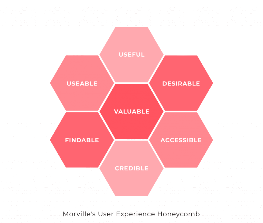
Understanding your audience demographics is key to focusing your design goals. Your organization should consider how your brand identity, design concept, and website content layout will be perceived by that audience and if it will meet their accessibility requirements. Visual hierarchy guides users through content while maintaining aesthetic appeal, incorporating proper grid systems and responsive design principles for optimal user experience. To find your guiding light, consider utilizing tools such as Peter Morville’s UX honeycomb. Always consider if any design decision will make the product more useful, usable, findable, credible, accessible, desirable, and valuable. If choosing between aesthetics in design and function, consider what matters more to your user.
Choose Artistic Concepts & Typography with Care
Aligning Brand Identity Across Digital Platforms
View your organization’s website as part of your entire online ecosystem. Is it consistent with the branding of your online ads, social media, print, and physical objects? Keeping your internet landscape to one voice and one vibe communicates dedication and professionalism. Even if your brand uses humor, it should be consistent across all platforms.
Artistic visuals and language styles should be rooted in your brand—design elements should have a central thought or idea behind them. Validate your design and artistic choices to stay grounded. Why are you selecting this photo style? Does it reflect your brand? When people see this graphic choice will they think of your brand?
Choose Consistency Over Trends
Some websites are more flash than substance (fashion brands, for example) but there is a time and place to be trendy. A website that is consistent with your brand’s colors, typography, and image style is more impactful than anything fancy. If you are budget conscious, keep things simple and consistent rather than getting too ambitious with visuals you either can’t maintain or are too out-of-the-box and won’t align with your other brand assets (social, print, ads). When you have more resources and time, resist the urge to get swept away by trends and animations—remember that simple and clean is better!
Safe trends that might uplift your brand:
- Create and use branded video and animation across your social platforms.
- Subtle animations on your website improve user experience and load time.
- Mixing photography and graphics (shapes, lines, icons, photography, or illustrations) can be fun and give your assets a fresh and modern feel—just keep the patterns of use consistent.
- Large and bold typographic styles in your content headings are not particularly new, but a tactic utilized for aesthetic appeal. It also improves user experience! People tend to read headlines, so using this approach makes your website readable.
Be (Strategically) Bold
Strategically using unique colors and imagery style can help your website stand out. However, you must keep accessibility and color contrast in mind. Keep bright colors or interesting images as accents and use them to draw attention to features. Recently, companies have been putting major effort into their product photos. Some concepts are surreal! For examples, check out these companies:
You can capture standout photos by shooting them in unique, creative spaces. If you can’t achieve that, make sure they’re consistent and well-lit. If you have room to play with color and setting, go for it! Be bold, but keep your content readable. Make a statement, but don’t alienate your target audience.
Clean Layouts For Content
People come to your website looking for useful content, so content with clean layout that is easy to digest should be your top priority. Let your content breathe and consider whitespace as a way to break up your content. Avoid content presented as big blocky paragraphs, because no one reads them.
Professional design considers concepts such as Fitts Law which links the relationship of element size, movement, and time to improve accessibility and user experience. As you create or evaluate designs, remember that spacing is critical to aesthetic appeal as well as experience and accessibility.
Users Have Design & Usability Expectations That Have Nothing to do with Your Brand
Read up on Jacob’s Law and explore our usability testing guide. The general concept is that users spend more time on other companies’ websites than they do on yours. These external websites shape users’ expectations and cause them to learn specific interaction patterns for websites in your industry (and in general). So if you’re going to do something out-of-the-box and reinvent the wheel, your wheel needs to be significantly better. If you get too ambitious and fall short, your users will be disappointed quickly. That disappointment means you may have lost a potential lead or customer.
Brand identity and digital presence strategy and user experience are not, and should not, be mutually exclusive. They should co-exist in perfect harmony in your user interface design and the visual and interactive assets that you use across your entire online presence.
Important Information about Web Design Aesthetics and User Experience
- Web design aesthetics typically increase user engagement rates by 25-35% when properly aligned with user expectations and brand identity.
- White space improves content readability by creating visual hierarchy and reducing cognitive load for users.
- Web design aesthetics can improve conversion rates by up to 75% when combined with effective user experience principles.
- The WCAG recommends a minimum contrast ratio of 4.5:1 for standard text and 3:1 for large text to ensure accessibility.
- Aesthetic web design principles vary significantly across industries, with e-commerce sites focusing on product presentation and B2B sites emphasizing credibility.
- Sans-serif fonts at 16px or larger provide optimal readability for body text on digital screens.
- Well-designed websites with balanced aesthetics typically see bounce rates decrease by 28-35%.
- Content hierarchy should follow the F-pattern reading style for optimal user engagement.
- Web design aesthetics impact loading speeds, with properly optimized designs loading in under 3 seconds.
- Studies show that 38% of users will leave a website if they find the layout unattractive or difficult to navigate.