
4 Vital Brand Identity Elements with HomeEd
Written by Rachel Richards
What makes you fall in love with a brand identity system? Is it certain feelings that it evokes, like nostalgia, joy, or comfort? Do its brand guidelines and visual elements, such as the logo, colours, and typography, appeal to your brand perception? Or, is it because you’ve come to trust and rely on its products or services in your everyday user experience?
The short answer: All of the above, and more. Building a strong brand identity and visual identity system comes down to leaving an unforgettable impression in your target audience’s minds. From sharp visuals to punchy messaging, every design element matters.
So, where do you begin? Take a page out of our client HomeEd’s brand story. As one of Edmonton’s top affordable housing providers, they imagine a city where everyone has a place to belong. If you define and capture these key brand elements and design principles like HomeEd has, you’ll be off to a great start.
Crafting a Unique Brand Position in the Digital Landscape
It’s a competitive world out there. Your brand needs to determine how you’re different and better than other players in your industry. Why would your target audience choose you over the dozens of businesses jostling for their affection?
Understanding market positioning strategy is a crucial exercise to outsmart the competition. In HomeEd’s case, we’re helping them align their position with the progressive experience they provide. Other organizations may focus on quality, price, and customer service, but HomeEd centres their brand architecture around the community-driven cause of providing Edmontonians with better homes and brighter futures.

Designing a Memorable Logo for Digital Marketing Success
If your brand positioning is the brains behind your business, your logo is the face you present to the world. It’s one of the most important and instantly recognizable elements of your comprehensive brand identity and design system. So, how do you design a logo worthy of T-shirts and bumper stickers?
That subject has been hotly debated in the marketing world for decades. Brand consistency and visual hierarchy are, of course, key elements—your logo needs to be easily replicable on a variety of digital and print platforms. But, most of all, it needs to convey the emotional experience behind your brand voice. HomeEd’s logo is clean and structurally sound, but its bold lines give an air of warmth and empathy.

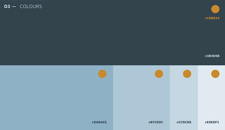
Leveraging Color Psychology in Digital Brand Strategy
There’s a whole field of consumer psychology devoted to colour theory, and you’d better believe that brands tap into it to shape their brand perception. Red is all about power and passion, while green is associated with nature and evolution. Pink brings romance and beauty to mind, but a few shades over, purple is associated with wisdom and royalty.
Be thoughtful and purposeful about the brand assets you select. This will help you shape your customer journey in the most positive way possible. For HomeEd, we went with a range of deep and sky blue hues as their primary palette, which conveys peace, trustworthiness, and sincerity. We complemented it with pops of warm orange, balancing the brand out with notes of optimism and hope.
Creating Impactful Taglines for Online Brand Recognition
If you could distill your entire brand experience and visual language into a few words, what would you say? That’s the heavy task of your tagline. We’ve heard all the greats—phrases like “Taste the rainbow”, “I’m lovin’ it”, and “Impossible is nothing” are embedded deep in our cultural consciousness.
So, what makes a memorable brand communication? Well, it helps if it rolls off the tongue, using literary techniques like rhyme, alliteration, and metaphor. Short and sweet is also better. Like poetry, your tagline needs to communicate your brand’s purpose in a concise and profound manner. The tagline “Built for belonging” conveys exactly who HomeEd is—they’re an inclusive brand that focuses on giving Edmontonians a place to call home.
Elevating Your Digital Presence with a Cohesive Brand Identity
These key elements are only the beginning of a successful brand identity and design system implementation. Typefaces, graphical elements, messaging, and brand personality are also crucial pieces of the puzzle. Our strategists and designers can craft a brand that your customers will love, so let’s schedule your comprehensive brand consultation today.
Important Information about Brand Identity Elements
- HomeEd measures their brand identity success through community engagement metrics, resident satisfaction surveys, and housing occupancy rates.
- Modern brand identity development relies heavily on consistent social media presence and engagement across all platforms.
- HomeEd reviews and refreshes their brand identity elements every 2-3 years to maintain relevance and effectiveness.
- A sustainable brand identity maintains core values while adapting to evolving market trends and customer needs.
- HomeEd’s brand identity resonates strongly with families and young professionals seeking affordable housing solutions.
- A complete brand identity overhaul typically requires an investment of $10,000 to $50,000 for mid-sized organizations.
- HomeEd maintains brand consistency through comprehensive brand guidelines and regular team training sessions.
- Approximately 25% of businesses update their brand identity elements annually.
- HomeEd’s brand identity system covers 12 distinct customer touchpoints throughout their service journey.
- The average implementation time for a new brand identity system takes 3 to 6 months.
Key Takeaways: Essential Elements of Brand Identity Development
- A strong brand identity combines visual elements, messaging, and emotional connections to create lasting customer relationships.
- HomeEd demonstrates how effective brand positioning can differentiate your organization in a competitive market.
- Your logo must be simple, versatile, and capable of conveying your brand’s core message across all platforms.
- Strategic color selection directly influences how customers perceive and interact with your brand.
- Memorable taglines distill your brand’s purpose into concise, impactful messages that resonate with your audience.
- Consistent brand implementation across all touchpoints strengthens market recognition and customer trust.
- Regular brand identity updates help maintain relevance while preserving core brand values.